From Doodle to Reality: The Story of The Guthrie
01.24.19
design
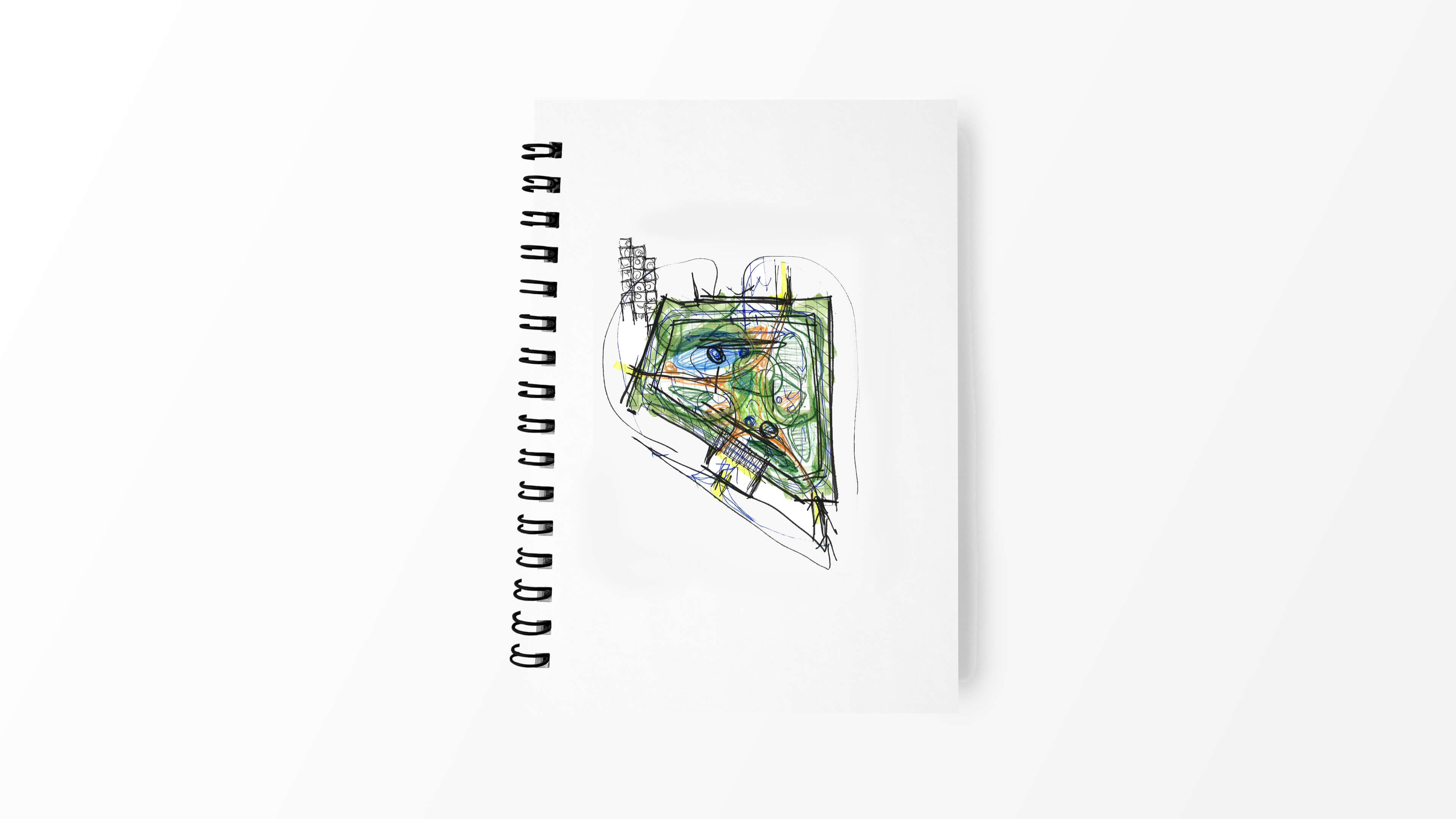
Paying homage to the physical framework and forms enveloping an old lumberyard in east Austin, an informal doodle inspired by site context was the genesis of an artful design motif that gives The Guthrie, a new multifamily development, a distinctive and stylish character — from the logo and large-scale exterior expressions down to the interior signage system.
The design team recognized the need for The Guthrie to look and feel harmonious with its urban context and diligently studied the area early in the design process, exploring the Govalle neighborhood and its eclectic character. Gems like the midcentury modern sign in front of Sawyer & Co., a nearby diner with a retro look and feel, provided aesthetic inspiration.
Back in the studio, casual sketching of the site’s primary corridors and adjacencies unexpectedly generated a contextual form that would evolve into a dynamic logo. Formerly home to the Guthrie Lumberyard, the site near East 7th Street and Tillery Street is partially bounded by train tracks, Boggy Creek meanders just north of the site, and doodling along that urban framework naturally produced an angular G shape.
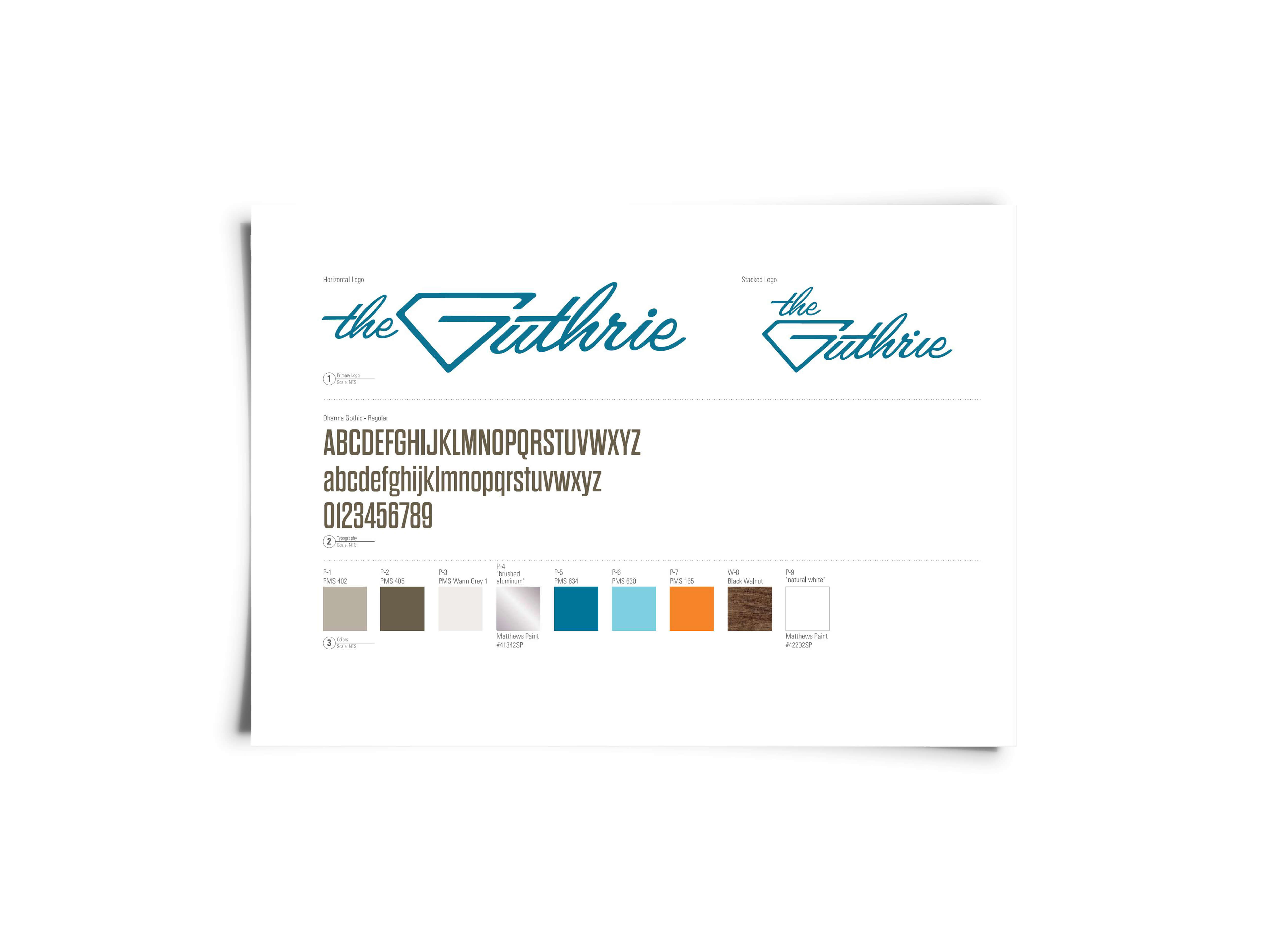
When TBG’s environmental graphics team saw the G-shaped doodle, they saw the beginnings of a sleek brand identity and began to develop the idea, incorporating the G into the mid-century modern aesthetic of the nearby Sawyer & Co. sign. The resulting design was a hit and, after presenting it to the project’s developer, an environmental graphics design scope was added to the landscape architecture component.
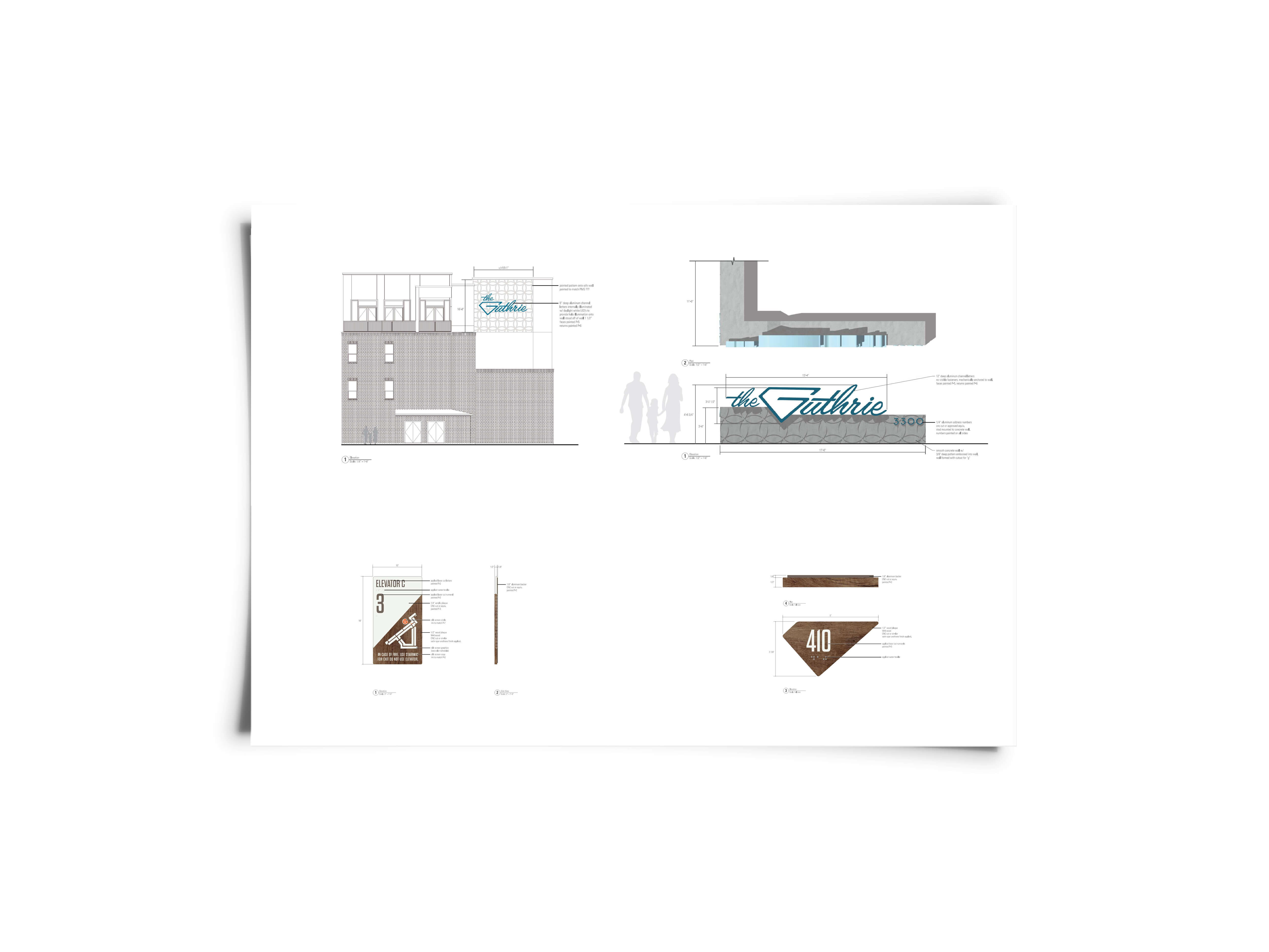
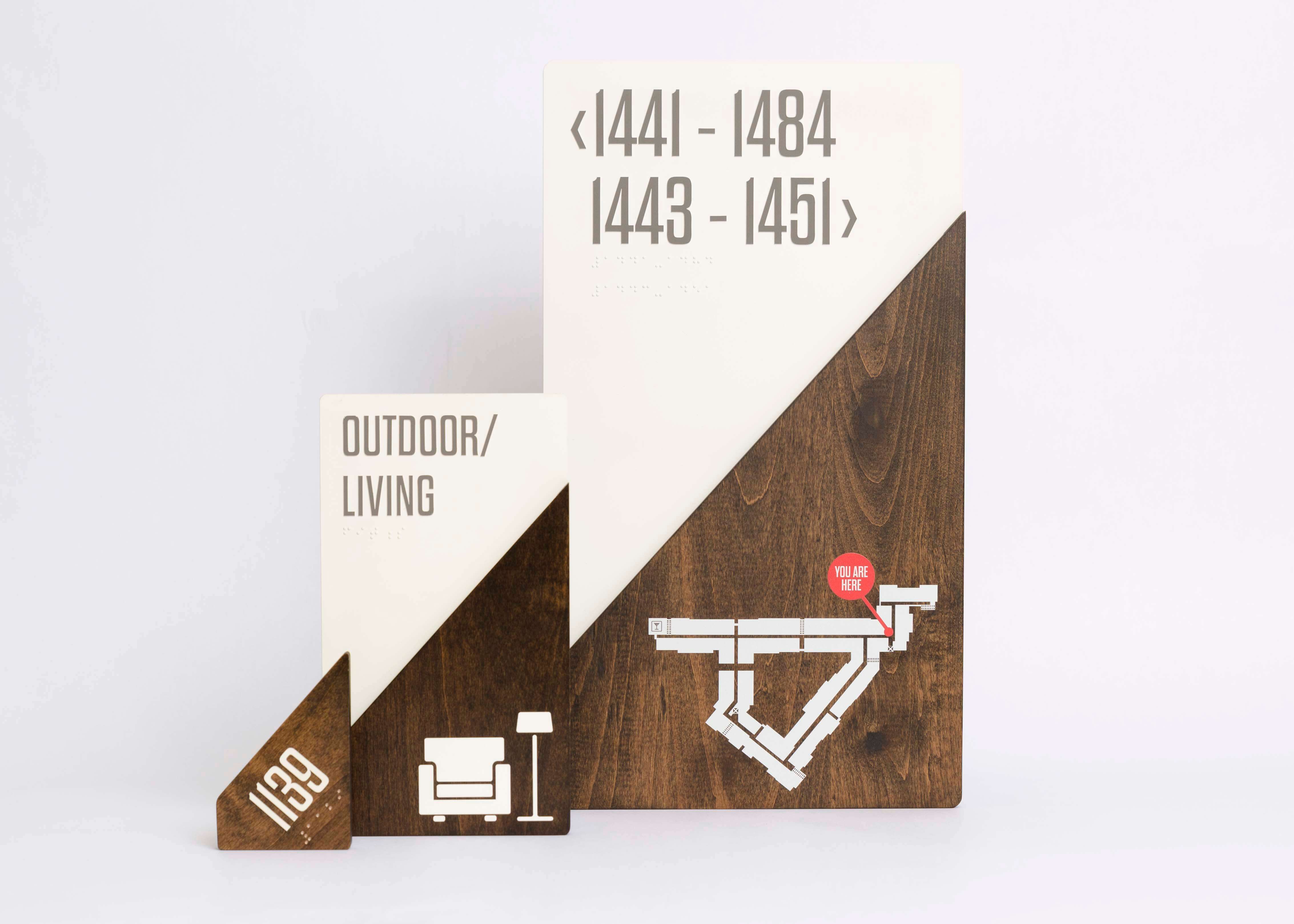
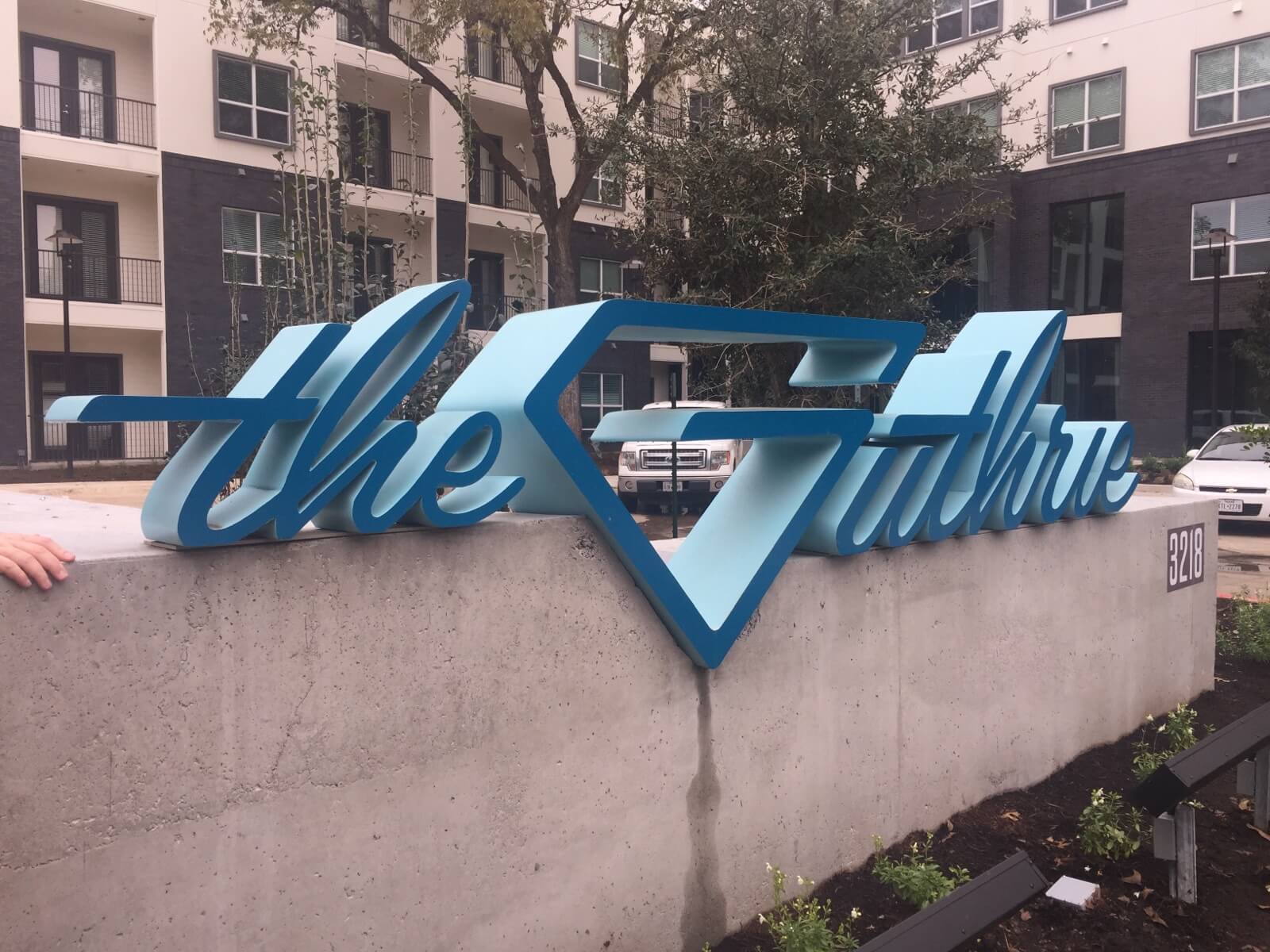
Reflective of the site, the G shape became the project’s logo, is featured in a prominent entry signage feature, and became an interlocking building block for an integrated signage system including room identification plaques, restroom and amenity signage. As a nod to the land’s history as a lumberyard, all of the project’s signs are wooden (stained alder), and since the G shape has a right angle, the pieces can interlock as rectangles for the common areas.
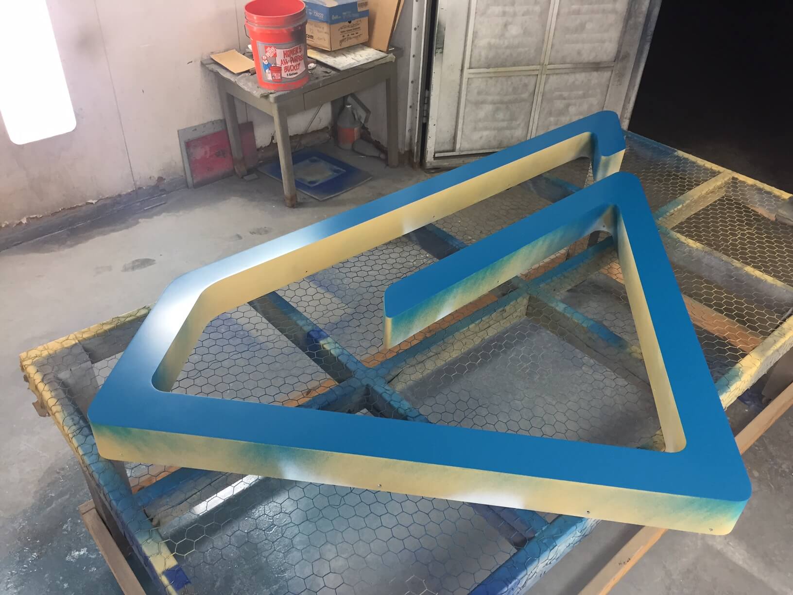
Inspired by the spirit of the handcrafted east Austin old lumberyard feel, the signs’ materiality is sculptural and architectural — the result being closer to art than a sign. When it came time for the sign fabricator, Capital Architectural Signs, to build the pieces, they enlisted a company experienced working with sheet metal and auto body work to attain that handcrafted look and feel.
The shape extends to the landscape’s design and character as well, including its use in a tile feature wall in the project’s amenity courtyard, which spans more than half an acre and includes a pool, lawn, fire pit seating area, an abundance of trees, and other features for relaxation.
The Guthrie feels right at home in its east Austin setting, with its unified character from the large-scale entry signage and script and logo on the side of the building down to individual G-shaped room identification signs and tile in courtyard. A serendipitous doodling of an oddly shaped site inspired The Guthrie’s logo and became a dynamic building block to the destination’s overall identity — thanks largely to the power of holistic placemaking achieved through collaboration between TBG’s landscape architecture and environmental graphic design studios.
